

Bottom Line: ActivityWatch is a rigorously local, open-source answer to the surveillance-state productivity market, trading corporate polish for absolute data sovereignty.
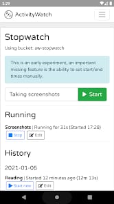
The core experience of ActivityWatch is one of "set and forget," but the "forget" part only works if you’ve survived the "set" phase. Unlike commercial trackers that attempt to guess what is "productive" through proprietary algorithms, ActivityWatch provides a blank canvas.
The Logic of the Watcher
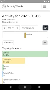
The application operates through a decentralized architecture of watchers. These are small, independent processes that report back to a central server—which, crucially, is running on your local machine. The AFK watcher is perhaps the most vital; it monitors input activity to distinguish between you actually working and you leaving a document open while you wander off to make coffee. When combined with the window watcher, the resulting data is a startlingly accurate timeline.
For developers, the integration is where ActivityWatch truly shines. By installing plugins for VS Code or Vim, you aren't just tracking "time spent in an editor"; you are tracking time spent on specific projects or even specific files. This level of granularity is a boon for freelancers or anyone needing to justify their billable hours without manual timer-starting gymnastics.
The Categorization Steeplechase
The real "utility" of ActivityWatch is locked behind its categorization engine. The software ships with basic categories, but to get the most out of it, you must dive into the Custom Rules. This is where the "Senior Tech Critic" in me gets both excited and annoyed. The app allows you to use regular expressions to filter your data. If you want every window containing the word "Budget" or "Spreadsheet" to be filed under "Finance," you can do that.
The friction here is palpable. For the average user, writing regex is about as intuitive as performing self-dentistry. But for those who speak the language, it offers a level of control that no "smart" algorithm can match. You aren't at the mercy of a developer's definition of "work"; you are the architect of your own productivity metrics.
The Dashboard: Data over Decoration
Accessing your data happens through a web-based dashboard. It is utilitarian to a fault. The Sunburst charts are brilliant for seeing the macro-to-micro breakdown of your day, but the interface lacks the "gamified" dopamine hits of its competitors. There are no streaks, no badges, and no weekly reports sent to your email (because, again, there is no email server).
The user experience flow is intentionally passive. You check the dashboard when you want to learn something, not because the app is begging for your attention. This lack of "onboarding friction" once configured is refreshing. It’s a tool that respects your time while it tracks it. However, the dashboard's aesthetic—while clean—feels more like a technical readout than a polished consumer product. It is functional, but it lacks the "vibe" that makes daily review a pleasure rather than a chore.