


Bottom Line: Facebook has transcended its origins as a social network to become an indispensable, if cumbersome, digital utility for community life. Its strength lies in an unparalleled suite of tools for group organization and local commerce, but this comes at the cost of a complex interface and significant privacy trade-offs.
Facebook’s modern user experience is a study in contrasts, a delicate and often precarious balance between utility and entertainment, connection and cacophony. To truly analyze the platform in its current form is to dissect a digital hydra, where every feature is intertwined with another, creating a user journey that is powerful and comprehensive, yet frequently overwhelming.
The Utility-First Social Contract
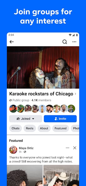
The platform’s most profound evolution has been its pivot, intentional or not, from a purely social space to a utility-first service. While newer networks like TikTok are designed as "entertainment-first" content firehoses, Facebook’s core job-to-be-done for many of its most active users is fundamentally practical. People use it to organize a school fundraiser, find a local plumber recommended by neighbors, sell a used bicycle, or check the time of a community meeting. The social aspect—viewing photos of a cousin's vacation—is often secondary to these utilitarian functions. This is the source of its enduring stickiness. Leaving Facebook might mean missing out on your kid's soccer team schedule or the only forum for your niche hobby. This dynamic is most evident in the Groups feature, which has become one of the most powerful and understated tools on the internet for community organization, for good and for ill. It’s a tool so effective that it has become essential infrastructure for millions of micro-communities.
The "Everything App" and Its Discontents
The strategic decision to integrate a vast array of functions into a single application has created an interface that is a masterclass in information density, but also a source of constant, low-grade friction. The user experience flow is often jarring. In the span of a minute, a user can scroll past a deeply personal post about a friend’s health, a heated political debate in a local news group, a targeted ad for a product they briefly considered, and a Marketplace listing for a used lawnmower. This "context collapse" is a defining characteristic of the Facebook experience. While the navigation has been refined over years of A/B testing, the app can still feel like a labyrinth of notifications, menus, and sub-sections. The blue-and-white interface, while familiar, serves as a functional but uninspired container for this chaotic mix of content. The design challenge—to create a coherent UI for an app that is simultaneously a family album, a newspaper, a town hall, and a flea market—is immense, and the solution has been one of practicality over elegance.
The Algorithmic Engine and Its Repercussions
At the heart of the experience is the News Feed algorithm, a sophisticated and opaque system designed for a single primary purpose: to maximize user engagement. This engine is what powers the platform’s multi-billion dollar advertising business. It learns from every click, like, and share to build a model of your interests, and it serves you content to keep you on the platform longer. As noted in external analysis, this can be a double-edged sword. While it can surface genuinely interesting content and foster connections, its relentless optimization for engagement can also amplify sensationalism, outrage, and misinformation. This is the central paradox of Facebook: the very mechanism that makes it a compelling and personalized product is also the one responsible for its most significant societal criticisms. The user is in a constant, implicit negotiation with the algorithm, their attention the currency being exchanged for the platform's utility. The "controversies" that have plagued the company, as documented on platforms like Wikipedia, are almost always downstream of this core mechanic.