Bottom Line: Google Keep, while rarely the darling of productivity discourse, remains a remarkably effective, no-frills note-taking application. Its seamless integration within the Google ecosystem and unwavering reliability make it an indispensable tool for quick captures and collaborative organization on iOS and Android.
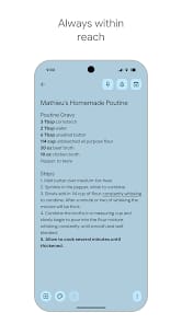
Google Keep's enduring appeal lies not in its groundbreaking innovation, but in its unwavering commitment to efficiency and accessibility. For twenty years, I've observed countless applications promise to revolutionize productivity, only to fall under the weight of their own complexity. Keep defies this trend by embracing simplicity. The core mechanic is immediate capture: open the app, jot down a thought, and close it. This low-friction entry point is its most potent weapon. Voice memo transcription is a particular boon, transforming fleeting ideas into persistent text without the need for manual input—a crucial feature for those of us constantly on the move.
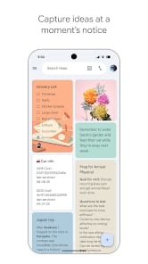
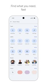
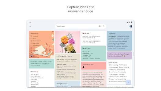
The card-based UI is a masterclass in visual organization. Each note exists as a distinct, manipulable entity, and the ability to color-code these cards provides an immediate, almost subconscious layer of categorization. This visual parsing is significantly faster than sifting through endless text lists. Labels function as robust tags, allowing for cross-cutting themes, while pinning critical notes ensures that vital information remains at the top of the digital desk. This intuitive system allows users to create their own organizational schema without wrestling with rigid folder structures or complex hierarchies, a common frustration in more elaborate note-taking solutions.
However, Keep is not without its limitations. Its strength as a quick capture tool often translates to a weakness in managing complex projects or hierarchical information. For extensive research, long-form writing, or deep project planning, Keep quickly shows its shallow depth. There's no robust version history, no nested note structure, and its search functionality, while effective for keywords, struggles with nuanced semantic queries. It's a digital corkboard, not a digital library. The "Google Workspace integration" is often cited as a strength, and it is, to a point. It's a connectivity that feels more like convenient adjacent functionality than a truly fluid, bi-directional data flow. One can pull a Keep note into a Google Doc, but the reverse is less elegant. This isn't a criticism of its stated purpose, but a necessary distinction for discerning users who require more than a digital Post-it.
User Experience Flow
The user experience is undeniably smooth. Launching the app on either iOS or Android is swift, and the options for creating a new note—text, list, drawing, voice, or image—are immediately presented. The gesture-based interactions, such as swiping to archive, feel natural and contribute to the app’s overall responsiveness. Reminders, both time and location-based, are deceptively powerful. Setting a reminder to "buy milk when I get to the grocery store" leverages device location services without user intervention, a prime example of ambient computing done right. This proactive assistance minimizes the mental burden of remembering granular tasks, freeing up cognitive resources for higher-level work.