
Bottom Line: Windy.com is a professional-grade command center that replaces vague "partly cloudy" icons with raw, actionable atmospheric intelligence. It is the gold standard for anyone who treats the weather as a variable to be managed rather than a surprise to be endured.
The brilliance of Windy.com lies in its refusal to simplify the complex. In an era of "glanceable" UI, Windy demands your attention. When you open the app, you aren't greeted by a temperature reading; you are greeted by the planet.
The Interface of Flow
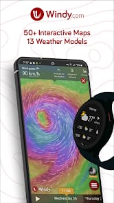
The core user experience revolves around a fluid, time-scrubbing mechanic. By dragging a slider at the bottom of the screen, you initiate a visual simulation of the atmosphere. Wind particles flow across the screen, intensifying in color as they pick up speed, while color-coded overlays represent everything from temperature gradients to dust mass. It is a masterclass in data density. Despite the sheer volume of information being pushed to the device, the performance remains remarkably smooth. This isn't just aesthetic flair; it allows a user to identify the exact moment a cold front will break or when a tropical cyclone's eye will make landfall with a level of precision that traditional list-based apps cannot match.
Model Pluralism
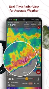
The most significant technical advantage Windy offers is model transparency. Most weather apps pick a single data source and present it as gospel. Windy exposes the friction between competing computational theories. If the ECMWF predicts a 2-inch snowfall while the GFS suggests a total miss, Windy shows you both. For those whose livelihoods or safety depend on the weather, this transparency is vital. It allows for a "weighted" understanding of risk. The inclusion of high-resolution local models like HRRR provides an even more granular look at convection-rich environments, making it a favorite for those tracking severe thunderstorms in real-time.
Professional Utility vs. Casual Friction
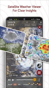
There is an inherent learning curve here. A casual user might find the "CAPE Index" or "Geopotential Height" layers bewildering. However, Windy doesn't apologize for this. The onboarding process is minimal because the tool is built for those who already know what they are looking for—or are willing to learn. The integration of Doppler radar and satellite composites is equally robust, offering global coverage that feels cohesive rather than a patchwork of different regional sources.
The monetization strategy is equally refreshing. While many utilities have succumbed to aggressive "freemium" models that gate basic functionality, Windy’s free tier is incredibly generous and, crucially, ad-free. The Premium subscription offers faster data updates and more granular time steps (1-hour increments vs. 3-hour), which is a fair trade for the professional user who requires the highest temporal resolution. It’s a sustainable model that respects the user's focus.