
Bottom Line: Call of Duty: Mobile delivers a stunningly complete, console-grade FPS experience that stands as a technical marvel on mobile hardware. However, its excellence is held back by a cluttered, overwhelming interface and a monetization model that borders on predatory.
The Core Loop: Authenticity Above All
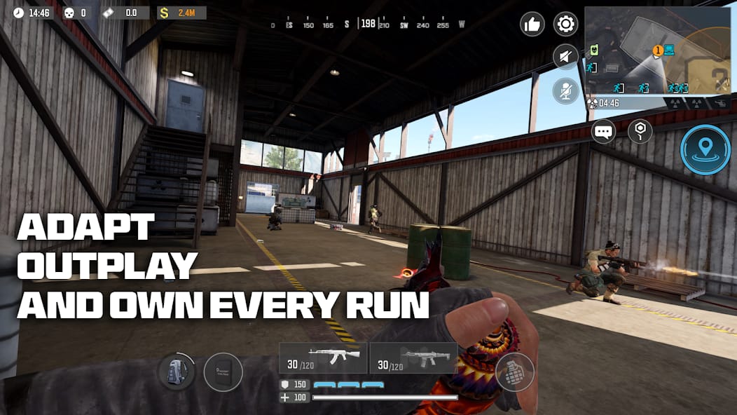
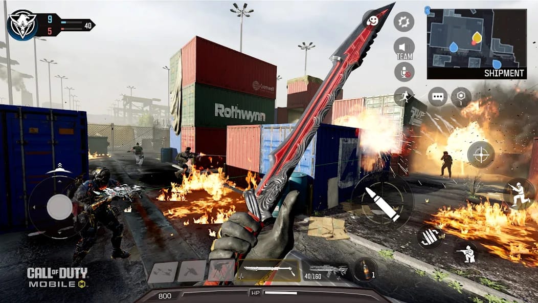
The single most important aspect of a Call of Duty game is the feel of its gunplay, and this is where Mobile absolutely triumphs. The moment-to-moment combat is fast, fluid, and unforgiving. Weapons have a satisfying weight and recoil, and the sound design is superb, creating an immersive battlefield soundscape of cracking gunfire and roaring killstreaks. The developers understood that simply porting the name wasn't enough; the kinetic, responsive action had to be preserved. For veterans of the series, the muscle memory translates almost immediately. The rapid time-to-kill (TTK) ensures that reflexes and map knowledge are paramount, making every encounter a high-stakes duel of positioning and aim.
This pursuit of authenticity is the game's greatest strength. The experience isn't just like Call of Duty; it is Call of Duty. Whether you're quick-scoping with a sniper rifle in a tight corridor or holding down a hardpoint with an LMG, the core gameplay loop is as addictive and rewarding as it is on a console or PC. This is not a simplified, "tap-to-shoot" mobile experience. It demands mechanical skill.
A Mountain of Content, A Mess of Menus
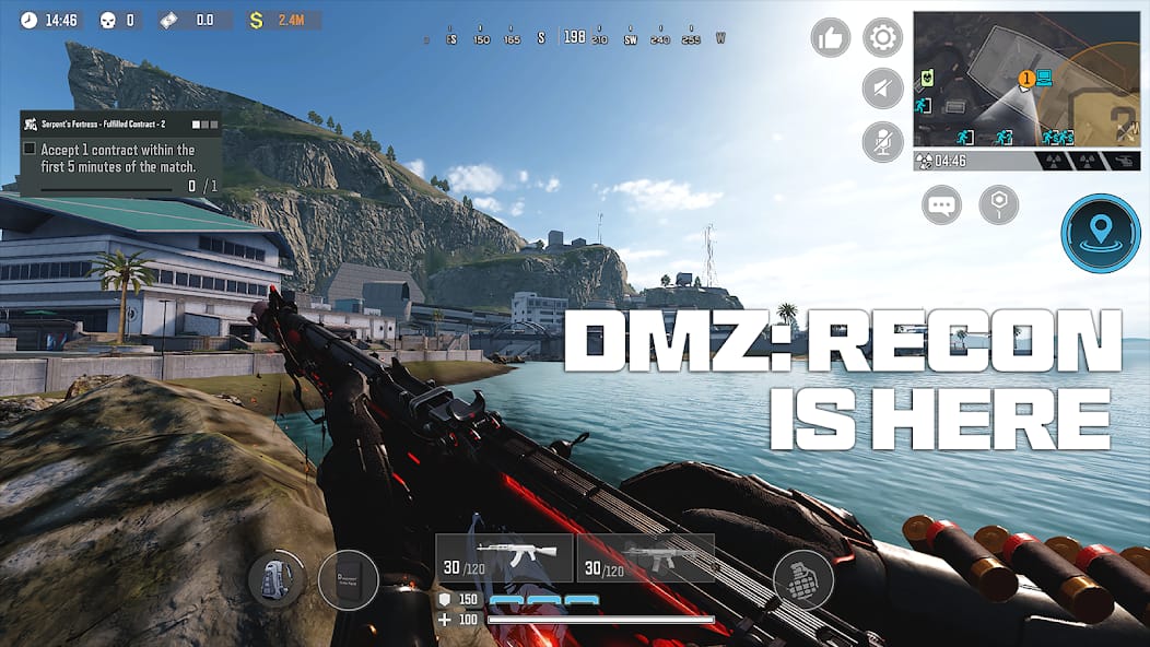
While the core gameplay is stellar, the wrapper it comes in is not. The game is drowning in its own content. The user interface is a labyrinth of competing notifications, currencies, events, and progression tracks. Launching the game is to be met with a barrage of pop-ups for lucky draws, new crates, battle pass progress, and limited-time offers. This creates significant onboarding friction for new players and is a constant source of annoyance for veterans.
The user journey from wanting to play a match to actually being in one is fraught with needless steps. Every screen is plastered with glowing icons and red dots, a design philosophy that screams for the user's attention and, more cynically, their wallet. This stands in stark contrast to the clean, functional interfaces of its console counterparts. While the sheer volume of things to do is a clear value proposition, the inability—or unwillingness—to present it in a clean, intuitive manner is the game's most significant design failure. It feels less like a premium product and more like a digital storefront that happens to have a brilliant shooter attached.
The Monetization Machine
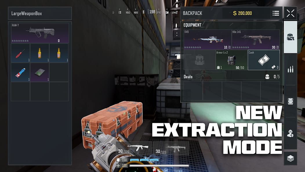
As a free-to-play title, monetization is a given. The model here avoids a direct pay-to-win scenario for the most part; core weapons are earned through gameplay, and the most powerful items are restricted to cosmetics. However, the implementation is anything but player-friendly. The system is built around randomized "lucky draws" and "crates," which are nothing more than slot machines with military skins.
These mechanics prey on FOMO (fear of missing out) by offering tantalizing, limited-time "Mythic" or "Legendary" weapon blueprints with unique visual effects and kill animations. The odds of acquiring these items are typically abysmal, requiring players to spend upwards of $100 or more to guarantee the grand prize. While purely cosmetic, this aggressive, gambling-adjacent model feels exploitative and sours the entire experience. It constantly undermines the game’s premium feel, reminding you that despite the console-quality gameplay, this is a product designed, first and foremost, to extract money.