Bottom Line: Tiny Glade is a masterclass in subtractive design, stripping away the stress of resource management to deliver a tactile, sophisticated digital toy that makes architectural creation feel like magic.
The Brilliance of Procedural Intuition
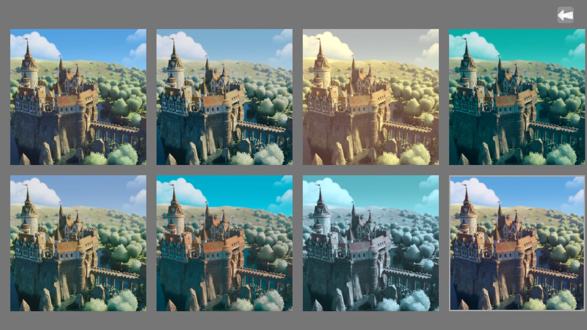
The core triumph of Tiny Glade is its invisible intelligence. In most builders, the user is a laborer, painstakingly placing individual assets from a cluttered menu. Here, you are a conductor. The interaction model is built on procedural reactivity. When you draw a stone wall that intersects a pre-existing path, the game doesn’t trigger a collision error; it builds an arch. If you tuck a small building into the shadow of a larger one, the lighting engine and asset selector cooperate to add moss to the stones or change the flower types in the window boxes.
This creates a feedback loop that feels remarkably tactile. There is a "crunch" to the stone placement and a "poof" to the greenery that makes the act of creation feel physical. The software anticipates intent with startling accuracy. It understands that a path leading to a wall implies a door, and a building placed on a steep incline requires a foundation of rugged stonework. By automating these logical leaps, Pounce Light allows the user to remain in a state of creative flow, unburdened by the technicalities of architectural integrity or asset clipping.
Constraint as a Creative Catalyst
While critics might argue that the lack of goals makes the experience "thin," they are missing the point. The absence of a win condition is a deliberate design choice that recontextualizes the player's relationship with the screen. In a typical strategy game, a wall is a defensive utility; in Tiny Glade, a wall is a texture, a boundary, or a canvas for climbing ivy.
This shift transforms the gameplay from a series of problems to be solved into a series of aesthetics to be explored. You aren't building a castle to withstand a siege; you're building a ruin because the way the evening light hits the crumbled stone is beautiful. The "gameplay loop" here is entirely internal—it is the spark of an idea followed by the immediate, frictionless realization of that idea. This is the "toy" philosophy at its peak. Like a box of high-end wooden blocks, the value isn't in the completion, but in the process.
The UI of Minimalism
The interface is a study in restraint. There are no sprawling tech trees or buried sub-menus. The tools are represented by simple, elegant icons that stay out of the way, allowing the focus to remain on the center of the screen. This onboarding friction is non-existent. Within thirty seconds of launching the app, any user—regardless of their gaming literacy—can produce something that looks professionally designed.
However, this simplicity does come with a caveat: the asset library is currently focused. You are largely limited to a specific European pastoral aesthetic—think "fairytale ruins" and "English countryside cottages." While what is there is executed with obsessive detail, power users may eventually find themselves bumping against the edges of the current palette. The game trades breadth for extreme depth of interaction, a gamble that pays off for the target audience but may leave those seeking "hours-per-dollar" metrics feeling underserved.