


Bottom Line: Flightradar24 remains the unrivaled gold standard of aviation tracking, transforming raw ADS-B telemetry into a high-fidelity, interactive window into the global sky. It is an essential utility that manages to be both a professional-grade tool and a mesmerizing hobbyist playground.
The core experience of Flightradar24 is built on the thrill of transparency. Opening the app reveals a swarm of yellow aircraft icons—a visual representation of the staggering complexity of modern logistics. The interface avoids the trap of over-simplification; it feels like a professional tool, yet remains accessible. Tapping on a flight doesn't just give you a name; it gives you a story. You see the flight’s path, its altitude fluctuations, and its ground speed.
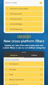
The Democratization of Telemetry
The utility’s greatest achievement is how it handles metadata. For the uninitiated, seeing a "Boeing 787-9 Dreamliner" is interesting. For the enthusiast, seeing the specific registration and the "age" of the airframe is vital. Flightradar24 presents this information with surgical precision. The UX flow is remarkably flat; there are no deep menus to get lost in. You tap a plane, the info pane slides up, and the world of that specific flight is laid bare.
The 3D View is where the app flexes its technical muscle. While it might seem like a gimmick at first, it provides a unique spatial understanding of a flight’s approach or its navigation through difficult terrain. It isn't a flight simulator in the gaming sense, but as a visualization of real-world data, it is a triumph of engineering. It bridges the gap between abstract numbers on a screen and the physical reality of a pressurized metal tube moving at 500 knots.
The Augmented Reality Hook
The AR view is the "wow" feature that converts skeptics. By utilizing the magnetometer and accelerometer in modern smartphones, Flightradar24 identifies that tiny speck of white at 35,000 feet with startling accuracy. It's a frictionless experience: point, wait a second for the sensors to settle, and the flight number appears. This feature alone transforms a casual walk into an educational experience. It’s the kind of tech that feels like magic the first three times you use it.
The Subscription Friction
However, no critique is complete without addressing the monetization strategy. Flightradar24 has moved aggressively toward a tiered subscription model (Silver, Gold, and Business). While the basic service is free, the "free" experience is increasingly hampered by advertisements and the locking away of historical data.
Want to see where a flight was three weeks ago? That will cost you. Want aeronautical charts or weather overlays (like volcanic ash or intense lightning)? That’s behind a paywall. While the developer has every right to monetize such a massive data operation, the density of ads in the free version can occasionally feel at odds with the "premium" feel of the tool. It creates a friction point where the casual user might feel "nickel-and-dimed" for features that were once more accessible. That said, for anyone who uses this for more than five minutes a week, the Silver tier is a justifiable expense for the sheer volume of data provided.