
Bottom Line: Locket Widget is a surgical strike against the algorithmic bloat of modern social media, reclaiming your phone's most valuable real estate for actual human connection.
The Reciprocity Loop
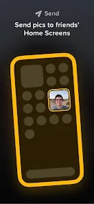
Locket succeeds because it exploits a specific kind of low-stakes friction. On Instagram, there is a psychological burden to posting—you need the right lighting, the right caption, and the right "vibe." Locket strips that away. Because the photo is going directly to a "Crush" or a "Best Friend" widget, the expectation is authenticity, not perfection. The gameplay loop, if we can call it that, is one of effortless reciprocity. You see a photo of your friend's morning coffee; you tap the widget, snap your own messy desk, and send it back. The entire transaction takes four seconds.
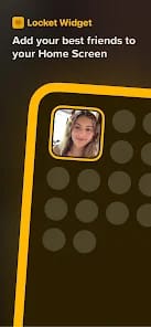
This speed is the app's greatest asset. By moving the interaction to the home screen, Locket removes the "discovery" phase of social media. You don't have to go looking for your friends; they are already there, sitting between your Mail app and your Calendar. It’s a brilliant use of persistent UI that treats the smartphone interface as a shared canvas rather than a private silo.
The Home Screen as an Interface
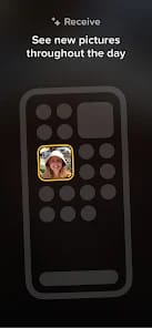
We are seeing a trend where the app icon is becoming less important than the data it surfaces. Locket is at the forefront of this "headless" app movement. Most users will rarely "use" the Locket app in the traditional sense. They will interact with the widget. This requires a level of technical reliability that is difficult to maintain. When the widget fails to refresh—a common complaint among the user base—the entire illusion of intimacy shatters. A frozen widget isn't just a bug; it's a broken promise.
Premium Friction and the "Gold" Problem
The introduction of Locket Gold is where the purity of the vision starts to blur. The primary appeal of Locket is its "live" nature—the knowledge that what you see is what is happening now. Allowing users to upload from the camera roll via a subscription fee introduces a "pay-to-curate" mechanic that threatens the app's raw authenticity. While I understand the need for monetization, tethering the ability to share past memories to a monthly fee feels slightly cynical for an app built on the "simplicity" of connection.
However, the "Rain" reactions—emojis that literally drop across the screen when you view a photo—add a layer of tactile feedback that keeps the experience feeling "toy-like" and fun. It avoids the sterile, corporate feel of a LinkedIn "Celebrate" button, opting instead for a playful, almost chaotic visual language.