Bottom Line: Minimalist Phone is a brutal, effective intervention for the dopamine-addicted, succeeding by turning your high-definition distraction machine into a functional, monochrome tool.
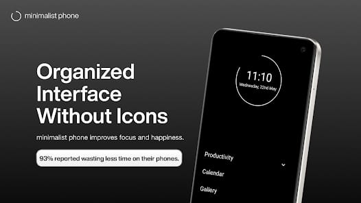
The core brilliance of Minimalist Phone lies in its understanding of neuroplasticity and habit loops. Most digital well-being tools fail because they rely on willpower—a finite resource. Minimalist Phone succeeds because it attacks the onboarding friction of a distraction. When you unlock your phone to "just check the weather" and find yourself thirty minutes deep into a thread about sourdough, it's usually because a bright icon caught your eye. By removing icons entirely, the app forces you to read. Reading is a higher-order cognitive function than pattern recognition; that split second of extra effort required to find the word "Instagram" instead of its purple-and-pink logo is often enough to let your prefrontal cortex regain control.
The Psychology of Friction
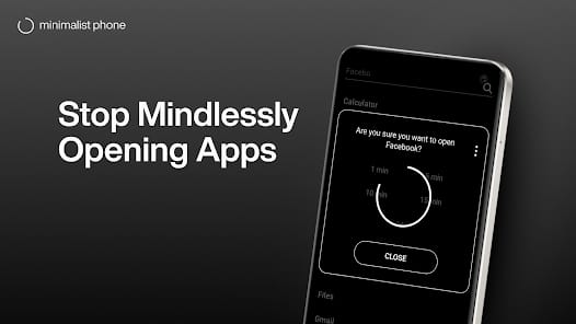
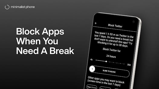
The Mindful Launch feature is the app’s most effective weapon. It’s a simple concept—a countdown timer before an app opens—but its impact is profound. It serves as a "circuit breaker" for the mindless reflex. During my testing, I found that roughly 40% of the time I triggered a Mindful Launch, I ended up closing the phone before the timer finished. I didn't actually need to be in the app; I was just bored. By introducing a deliberate delay, the app exposes the vacancy of our digital habits.
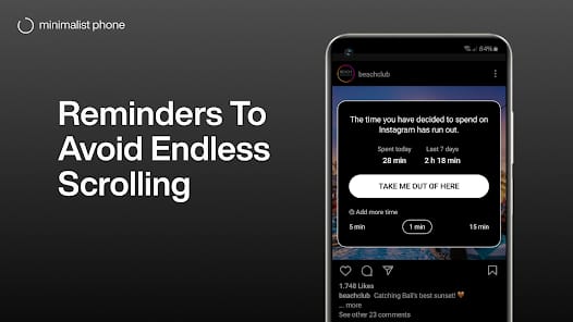
Furthermore, the In-App Time Reminders solve the "time-blindness" associated with infinite scrolls. Most social platforms are designed to make you lose track of time. Having a text prompt appear every five or ten minutes acts as a tether to reality. It’s annoying, yes, but that annoyance is the point. It’s a persistent reminder that your time is being harvested.
Interface & Workflow
Navigating Minimalist Phone feels like using a terminal from a 1980s sci-fi film. It is fast, efficient, and entirely devoid of joy. This is a compliment. The UI doesn't want you to linger. You swipe to see your apps, type a few letters to filter the list, and get out. The Notification Filter is equally disciplined. Instead of a chaotic stream of "Likes," "Sales," and "News," you get a quiet summary. This shifts the notification model from "push" (the phone interrupts you) to "pull" (you check the summary when you are ready).
However, the experience isn't without its hurdles. Moving away from a grid of icons requires a significant period of behavioral recalibration. For the first 48 hours, you will feel a phantom limb syndrome for your icons. You will swipe to where an app used to be, only to find a blank space or a list of words. This is the "withdrawal" phase, and it's where most users will either commit or delete the app. The learning curve isn't technical; it's psychological.