


Bottom Line: MuseScore's mobile application delivers an unparalleled library of scores and powerful practice tools, positioning itself as an essential companion for students and practicing musicians. However, its steadfast focus on consumption over creation leaves a glaring void for those who envision a truly comprehensive mobile music workstation.
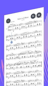
MuseScore's primary triumph lies in its sheer utility as a digital archive. To command access to millions of sheet music scores, from classical masterpieces to contemporary arrangements, all within the confines of a smartphone or tablet, represents a significant leap for the practicing musician. This immediate availability dismantles traditional barriers to repertoire access, allowing for spontaneous learning and practice wherever inspiration strikes. The interactive player is where MuseScore transitions from a passive reader to an active practice partner. The ability to precisely adjust tempo, isolating challenging passages with the looping function, mirrors the best aspects of dedicated music education software. The on-screen keyboard and note highlighting provide crucial visual cues, especially for sight-reading or internalizing complex rhythms, making practice sessions demonstrably more efficient.
However, the application’s design philosophy, while strong in its chosen lane, also dictates its most profound limitation. MuseScore on mobile is unequivocally a consumption device. The stark absence of any score creation or editing functionality is not merely a missing feature; it is an architectural decision that delineates the app's scope. For the composer, the arranger, or even the serious student needing to annotate or adapt scores, this omission relegates the mobile app to a secondary role, perpetually deferring to its desktop counterpart, MuseScore Studio. This bifurcated approach, while understandable from a development standpoint, introduces an inherent friction for power users who seek a more unified workflow across their devices.
Furthermore, the robustness of the user experience remains somewhat inconsistent. Despite overwhelmingly positive aggregate ratings on major app stores, a recurring chorus of user feedback points to persistent issues. Reports of bugs, login complexities, and opaque subscription management—particularly for the PRO tier, which gates crucial features like instrument volume control and offline access—undermine the polished facade. Such operational inconsistencies can introduce unnecessary cognitive load, distracting from the core musical engagement the app so effectively facilitates. The noted dissatisfaction with recent UI changes further suggests a chasm between developer intent and user expectation, a common pitfall in evolving digital platforms. While the educational component, MuseScore LEARN, promises structured growth, its integration must be seamless and intuitive to truly deliver on its potential without adding to the app's perceived complexity.
The Mobile Compromise
The platform-specific performance on Android, with its diverse ecosystem of devices and screen sizes, presents its own set of challenges. While the touch interface generally suffices for navigation and interactive player controls, the on-screen piano keyboard can feel cramped and imprecise on smaller phone screens, diminishing its utility for rapid input or complex chord practice. This necessitates a careful consideration of device form factor; tablets undeniably offer a superior canvas for MuseScore's visual density. The sporadic technical issues reported by users might also be exacerbated by Android's fragmentation, where optimizing for a myriad of hardware configurations becomes an arduous task, potentially contributing to the perceived instability on certain devices.