

Bottom Line: Reigns masterfully distills the complex, often absurd, art of governance into a deceptively simple swipe. It's a brilliant and endlessly replayable loop of power, peril, and political satire that is as engaging on the 100th reign as it is on the first.
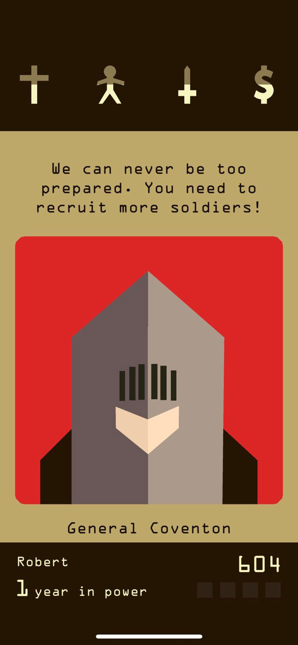
The genius of Reigns lies in its reduction of the grand, complex machine of statecraft into a tangible, personal, and immediate series of choices. The gameplay loop is intoxicatingly simple: a character presents a situation, you swipe, you observe the immediate impact via small dots above the four pillar icons, and the next card is drawn. This rapid-fire succession of dilemmas creates a compelling rhythm that makes it ideal for short play sessions, yet the strategic layer is deep enough to sustain hours of engagement.
The Gameplay Loop: A Masterclass in Consequence
At first, survival feels random. A few bad draws can lead to a swift and unceremonious death. However, as the player completes more reigns, patterns begin to emerge. You learn that the seemingly benevolent doctor who offers to cure your ailments may have ulterior motives tied to the church. You discover that investing in infrastructure pleases the people but can drain the treasury, leaving you vulnerable to military threats. The game is not just about reacting; it's about anticipating. The most rewarding moments come from successfully navigating a long chain of decisions, keeping all four pillars in delicate equilibrium, while simultaneously pursuing hidden objectives that advance the game's cryptic plot. This emergent storytelling, born from the interplay of simple rules, is where Reigns truly shines. It creates a powerful sense of player agency, where the history of your kingdom feels uniquely your own.
Interface and User Experience
The user interface is a triumph of minimalist design. By framing the game as a deck of cards, Nerial created an interaction model that is instantly understandable, echoing the simple-swipe UX of modern mobile applications. Character portraits are stylized and abstract, leaving much to the imagination and placing the focus squarely on the witty, well-crafted dialogue. The subtle visual cues—the aforementioned dots indicating which pillars will be affected—are a brilliant piece of UX design. They provide just enough information to make an informed choice without revealing the exact magnitude of the impact, preserving an element of risk and uncertainty in every swipe.