Overview
Every so often a game arrives that makes the rest of the industry look like it’s been playing it safe with a rubric. and Roger, developed by TearyHand Studio and published by Kodansha — yes, that Kodansha, the manga giant making an intriguing play for prestige interactive fiction — is one of those games. It launched July 23, 2025 at $3.49 on iOS, Android, Steam, and Nintendo Switch.
The premise sounds slight. On an ordinary morning, Sofia wakes to find her father isn’t home. In his place stands a stranger who speaks in riddles and keeps insisting she “take her medicine.” What follows is not a twist so much as a slow, dawning recognition: Sofia has dementia, and the “stranger” may be someone she has known her whole life. Her world looks slightly different than it did yesterday, and slightly more different today.
Here’s the crucial design decision: and Roger never tells you any of this through exposition. There are no clinical monologues, no tutorial pop-ups explaining Sofia’s condition. Instead, the game is built to make you experience it. Mundane household tasks — making tea, taking pills, answering the phone — are completed through unmarked, shifting buttons and puzzles that must be memorized and re-performed in the correct order. The UI itself is the disease. When the interface betrays the player, the game isn’t describing what cognitive decline feels like; it’s engineered so the player feels it.
Three chapters, roughly one hour. The game carries a 4.5 out of 5 store rating, and the concept alone — a major publisher backing a deliberately uncomfortable art game — is notable. But understand what this is first: not a “cozy story game,” not a walking simulator with pretensions. It’s a mechanical argument that games can convey lived experience more honestly than prose — and on paper, it wins the argument.
Key features
- Mechanics-as-metaphor: Sofia’s dementia is communicated entirely through gameplay — unlabeled controls, shifting layouts, and sequence puzzles that erode like memory itself. No exposition required.
- Three-act emotional arc: The hour-long story is structured to move players from distress to sympathy to hope, restructuring the relationship with the stranger as understanding deepens.
- True cross-platform availability: Full releases on Steam, iOS, Android, and Nintendo Switch, with an hour of content that fits naturally into a commute or a single evening.
- Point-and-click restraint: A deliberately sparse visual novel/interactive fiction hybrid that trusts silence, negative space, and the player’s discomfort to do the heavy lifting.
Analysis
Gameplay Loop
The core loop is simple on the surface: perform a household task, then perform it again. The first time, it’s trivial. Make tea. Press the kettle button. Done. The second time, the buttons have moved. Or lost their labels. Or — this is where TearyHand Studio gets genuinely nasty — the task has changed its logic while the interface insists nothing has changed.
This is the game’s masterstroke. Most narrative games about illness use dialogue as the delivery mechanism; the mechanics are a taxi that ferries the player to the next cutscene. and Roger inverts this. The puzzles are the storytelling. When the player fails to remember the order of steps for taking medicine, the game doesn’t scold or offer a hint after 30 seconds. It simply waits. The silence is more accusatory than any failure state in a Souls game, because the failure isn’t avatars falling off ledges — it’s the player being unable to complete a task a child could do. That gap between the player’s competence and Sofia’s circumstance is where the empathy is manufactured. It’s a design trick attempted before (Hellblade’s audio hallucinations come to mind) but rarely with this level of discipline on display.
The three chapters escalate the disorientation before deliberately pulling it back. By the final chapter, the interface stabilizes somewhat — and after an hour of fighting the UI, that stability is designed to land like relief after vertigo. The arc from distress to sympathy to hope isn’t poetic framing; the game literally tunes its usability curve to manipulate the player’s emotional state. That’s sophisticated design masquerading as simplicity.
Onboarding Friction (On Purpose)
The friction deserves direct treatment, because some players will bounce. The unmarked buttons are deeply frustrating, and unlike normal games, the game refuses to apologize for it. There is no accessibility toggle to “make the buttons clearer” — and arguably there shouldn’t be, since legibility is the thematic enemy. But this is a real tension: a game about accessibility of experience that is deliberately inaccessible to a portion of its audience. Players who bounce off frustration quickly, or who want their interactive fiction to respect their time, will find this maddening. We rate it a justified choice — but it’s the single biggest reason this isn’t a higher score.
Length and Value
One hour. At $3.49, the math is easy; the value question is harder. An hour that leaves a player sitting silently afterward is worth more than forty hours of checklist content. But it’s a one-and-done experience — replay value is near zero, since the entire design depends on not knowing what’s coming. Judge it as a film, not a service game.
Visuals & performance
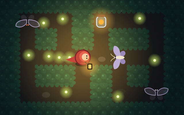
TearyHand Studio leans into a soft, muted, domestic aesthetic — gentle pastel interiors that grow subtly “wrong” as the game progresses. Nothing announces itself. The art direction’s restraint is the point: horror here isn’t rendered, it’s implied through details that are slightly off — a familiar room with an unfamiliar weight. It’s effective, occasionally chilling, and never exploitative.
Technically, this is a lightweight interactive fiction title and it’s built like one: a 2D game of this scope is light on hardware, and nothing in the design demands much of any of the four platforms. The UI design deserves special mention precisely because it’s designed to be bad while never feeling broken — a razor-thin distinction between “this interface is deteriorating” and “this game is janky.” The design stays on the right side of that line.
Platform nuances
- Steam (PC): The definitive way to play. Mouse precision makes the shifting-button puzzles land cleanly, and the larger screen amplifies the “wait, that wasn’t there before” effect.
- Nintendo Switch: An excellent fit for handheld play — an intimate, quiet game suits a small screen in a dim room. Docked play works but loses some intimacy.
- iOS / Android: Touch is thematically apt — physically poking at unreliable buttons mirrors the subject matter. The minor cost is that imprecise taps risk conflating the game’s intended confusion with touchscreen slop.
Final verdict
and Roger is a small game that thinks very big. It argues that interaction itself — not script, not cinematics, not voice acting — can be the vehicle for empathy, and it does so with a confidence most AAA studios can’t summon. The deliberate frustration will alienate a slice of its audience, and the one-hour runtime limits its shelf life, but neither flaw touches what the game is actually trying to do. TearyHand Studio, with Kodansha’s backing, has made a rare interactive work that justifies the medium. We recommend it — once. That’s all it needs.
Reviewed by the Rankeno Strategy & Sim Desk. Scores are out of 10; the overall score is the desk’s editorial judgement, informed by the four sub-scores above. How we review